The new Freelander 8 has attracted plenty of attention for its boxy styling, advanced technology and ambitious global plans.
But there is another detail hiding in plain sight.
The logo.
At first glance, the Freelander emblem appears to be a simple geometric shape.
Modern.
Minimal.
Almost abstract.
Look a little closer, however, and a clever detail begins to emerge.
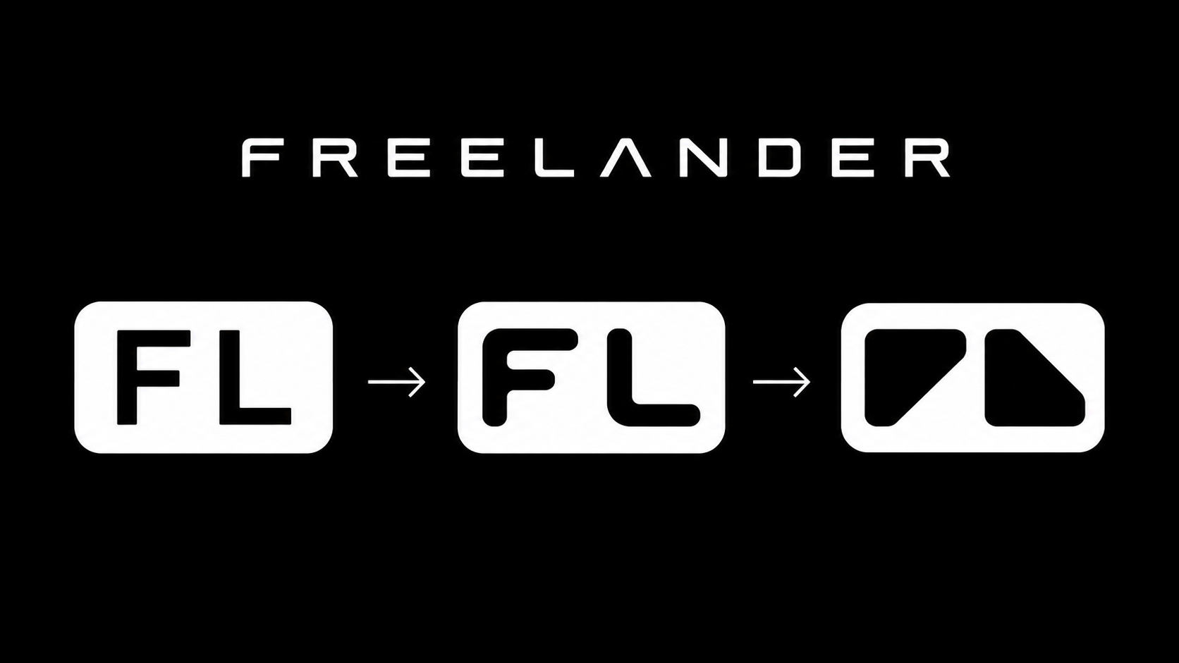
A Hidden F And L?
The most widely discussed theory is that the logo is built from an over-stylised "F" and "L".
The left-hand graphic element resembles a simplified letter F.
The right-hand graphic element resembles a simplified letter L.
Together they form the initials of Freelander.
Whether this was the original design intention or not, it is difficult to ignore the visual connection.
Like many successful modern logos, the design works on two levels.
At first glance it is simply a distinctive shape.
On closer inspection it reveals a deeper meaning.
Simplicity Is Powerful
There was a time when automotive logos were full of detail.
Coats of arms.
Animals.
Shields.
Complex typography.
Today's most successful brands often take the opposite approach.
Apple. Nike. Tesla. Rivian. Nothing.
All rely on simple forms that are instantly recognisable from a distance.
Freelander appears to be following the same philosophy.
The logo is simple enough to work on a smartphone screen, on a vehicle grille, on a wheel centre cap, on dealership signage, in social media content, and within vehicle software.
That flexibility is essential for a modern global brand.
More Than Just A Badge
The most interesting thing about the Freelander logo is that it does not simply appear on the vehicle.
The design language appears throughout the entire product.
Look closely at the headlights and you can see shapes that closely resemble the same geometric forms used in the logo.
The rear lights follow a similar theme.
Even some of the interior details appear to echo the same visual language.
This is not unusual among successful modern brands.
The strongest brand identities do not simply place a logo on a product.
They build the logo into the product itself.
The shape becomes part of the vehicle's DNA.
The Birth Of A Global Brand
This is perhaps where the logo becomes most significant.
Freelander is not simply launching a vehicle.
It is attempting to launch an entirely new automotive brand.
According to recent presentations, Freelander plans to operate in 90 countries and establish 1,100 dealerships around the world.
If those ambitions are realised, this logo will eventually appear on showrooms, charging hubs, mobile apps, vehicle key fobs, websites, merchandise, and millions of vehicles.
What we are looking at today may not simply be the badge of the Freelander 8.
It may be the visual identity of an entirely new global automotive company.
Why It Matters
Most people will never spend more than a few seconds thinking about a logo.
Yet some of the world's most valuable brands are recognised instantly from a single shape.
The Freelander symbol appears designed with exactly that goal in mind.
Clean. Simple. Modern. Recognisable.
And perhaps carrying a hidden "F" and "L" that links it back to the name that inspired it.
Today it is simply a small symbol appearing on TikTok videos and launch material.
But if Freelander achieves its ambitions, we may eventually look back at this logo as the moment a new global automotive brand found its identity.
By Simon Jefferson